Composable UI kit
The composable C++ immediate-mode kit used by the runtime and legacy plugins.
This kit belongs to the runtime and legacy C++/ImGui host, not the active Rust
Doppio. A panel is a tree of objects, cards and controls; plugins use the same model
so their panels look like the host's native panels. The Rust editor uses Iced
components and uikit/theme.rs instead.
Objects → Cards → Panels#
Panel
  └─ Card
       ├─ Toolbar
       │    ├─ Button
       │    └─ IconButton
       ├─ Row
       │    ├─ Card
       │    │    ├─ Label
       │    │    └─ SliderFloat
       │    └─ Card
       │         └─ Canvas
       ├─ PropertyGrid
       └─ NodeCanvasView
            └─ NodeElement
                 ├─ InputPin
                 └─ OutputPin
- Objects are leaves: button, slider, label, checkbox, combo, canvas, node, pin, progress bar, badge, text.
- Cards group objects on a raised surface:
Card,Row,Column,Grid,Section,Toolbar,ScrollArea. - Panels are dockable windows:
Panel,TabPage,NodeCanvasView,PropertyGrid. - App shells (
PanelRegistry,Workspace,PluginManager) own panels and docking; they never draw controls by hand.
The kit is header-only (caffeine/ui/UI.hpp), so plugins can compose the
same elements without linking the IDE. Underneath, each element still draws with
ImGui; the tree gives stable ids, layout, debugging and a single visual language.
Main elements#
| Group | Elements |
|---|---|
| Containers | Panel, Card, Row, Column, Grid, Section, Toolbar, ScrollArea, TabBar / TabPage, TreeView / TreeItem |
| Controls | Button, IconButton, Checkbox, SliderFloat, SliderInt, DragFloat, DragInt, Combo, TextInput, SearchField, PathField, MultilineText, DropZone, ColorPicker, SegmentedControl |
| Lists & data | ListItem, ListBox, AssetCard, DataTable / DataRow |
| Display | Label / Text, Paragraph, Badge, StatusDot, ProgressBar, Separator, Spacer, Image, EmptyState, KeyValue |
| Properties | PropertyGrid, PropertyRow, FloatProperty, IntProperty, BoolProperty, ChoiceProperty, ColorFieldProperty, Color3FieldProperty, TextFieldProperty, PathProperty, Vec2Property, Vec3Property |
| Canvas / nodes | Canvas, CurveEditor, NodeCanvasView, NodeElement, InputPin, OutputPin |
| Overlays | Dialog (modal body tree), CustomElement (host/legacy escape hatch) |
| Debug | UIContext::debugDump(), UIContext::drawDebugOverlay(), DebugPanel |
Example#
#include "caffeine/ui/UI.hpp"

using namespace Caffeine::UIKit;
using namespace Caffeine::UIKit::Elements;

Panel panel("My Tool", "Short description", "effects");
auto& card = panel.emplace<Card>("General");
card.emplace<Label>("Options", TextTone::Accent).setHeading(true);

auto& row = card.emplace<Row>("Actions");
row.emplace<Button>("Apply", ButtonVariant::Primary).setOnClick([&] { apply(); });
row.emplace<Button>("Cancel");

auto& grid = card.emplace<PropertyGrid>("Settings");
grid.typedRow<FloatProperty>("Amount", amount, 0.0f, 1.0f, 0.01f, "%.2f", true);
grid.typedRow<BoolProperty>("Enabled", enabled);

UIContext ctx;
ctx.draw(panel);
A Row shares leftover width between setGrow(true) children; a Card sizes to
its content; a PropertyGrid is just a two-column table of PropertyRows.
Canvas and nodes#
Canvas gives a draw callback with the origin and size of its surface. Use it for
previews, graphs, timelines or any custom visual that should still participate in
the element layout.
NodeCanvasView embeds the shared NodeCanvas and owns a list of NodeElements.
Each node owns its body elements, including InputPin/OutputPin and normal
controls. Links and graph semantics stay in the host tool.
Live catalogue#
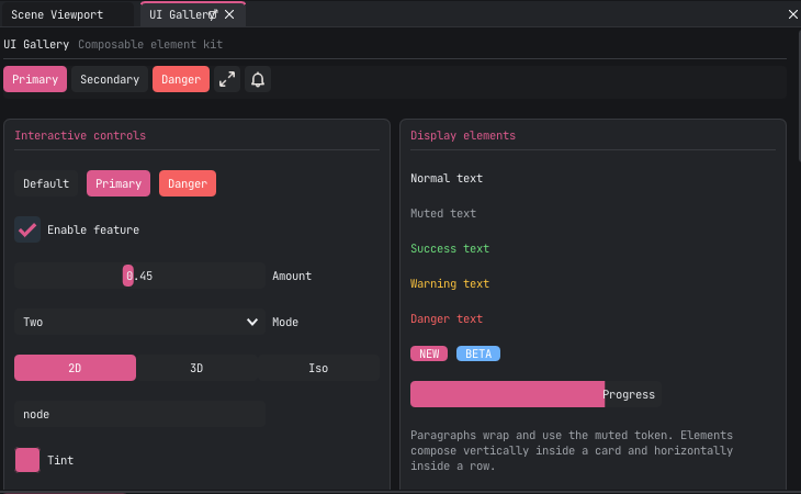
Open View → Panels → UI Gallery (or run the UI Gallery command). The panel
shows every element in context: buttons, inputs, text tones, badges, progress,
property rows, a custom canvas, a node canvas and the element debug tree.
Enable Draw hit rectangles in its Debug card to see the bounds and ids of every
element. UIContext::debugDump() returns the same information as text, which is
useful in tests and bug reports.
Rules#
- A leaf draws one thing; a container owns layout.
- Use theme tokens, never hard-coded colors.
- Give dynamic list items explicit ids; static siblings can be auto-numbered.
- Keep graph/link/serialization logic in the host, not in
NodeElement. - Migrate one piece at a time: the older free-function widgets are still supported and are the low-level vocabulary underneath the elements.
The headers live in
include/caffeine/ui/.
This kit is the legacy ImGui plugin SDK vocabulary. The active Doppio editor is
Rust/Iced and consumes the C ABI instead; see the
Rust UI notes.